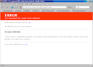
Part of my "things i hate about Squid" list includes the god awful error pages which haven't really changed since .. well, since I got involved with the project in 2000.
Here's my take on the "simple" error page. The text is exactly the same as the old error page (note that I haven't included the "Generated by.." footer text here, as thats included by Squid/Cacheboy) but I've reformatted the error page to use CSS for layout and then crafted a very simple example CSS.

No comments:
Post a Comment